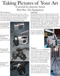
Traditional Art Week
It looks better in real life...
Scanner ate the colors!
The photo does not do justice.
How many times you have read or typed yourself such notes in artist’s comments, under traditional artworks?
You’re not alone; digitizing our drawings, paintings, sculptures and other traditional, hand-made artworks can be tricky. Of course the work is never exactly same when changing it from a concrete object to a picture on a screen, but a lot can be done to achieve as representative result as possible!
This is the first part of a basic guide how to make your traditional artworks look appealing when presenting them in the Internet. This is not about changing or manipulating your traditional artwork to something it is not originally, but helping you to make it look as good on a screen as it is in real life.
This guide is meant especially for beginning artists but maybe also more advanced artists can find something new to think about – and of course you’re welcome to share your best tips in the comment area of this article!
You’re not alone; digitizing our drawings, paintings, sculptures and other traditional, hand-made artworks can be tricky. Of course the work is never exactly same when changing it from a concrete object to a picture on a screen, but a lot can be done to achieve as representative result as possible!
This is the first part of a basic guide how to make your traditional artworks look appealing when presenting them in the Internet. This is not about changing or manipulating your traditional artwork to something it is not originally, but helping you to make it look as good on a screen as it is in real life.
This Part 1 introduces scanning and photographing tips.
The Part 2 advices how to edit the scanned/photographed artworks.
The Part 2 advices how to edit the scanned/photographed artworks.
This guide is meant especially for beginning artists but maybe also more advanced artists can find something new to think about – and of course you’re welcome to share your best tips in the comment area of this article!
FROM TRADITIONAL TO DIGITAL
Scanning
Scanning is a common and easy way to transfer your traditional pictures in digital format. Each scanner has their own properties but most of them allow you to crop picture and adjust its brightness, contrast and saturation. I usually edit my pictures afterwards with photo editing program rather than in scanning phase but if you don’t have any programs available or if you rather do editing right away, it can be useful to test different adjustment settings from your scanner to get the best possible scanning result.
Here are some examples of adjusting colors while scanning
(Click the thumbs if you need to see a bigger view)
At first is a general view of a plain scan preview, no edits whatsoever, and next to it a version where autoexposure is used.
As you can see, the plain version is quite dull but autoexposure gives it sharper and more vivid look.


Histogram adjustments allows you to adjust levels.
On the left there is a picture before adjusting and on the right side the picture afterwards.
I have dragged the cursors under the histogram a bit closer to the middle point.


Below you can see tone correction i.e. adjusting curves before and after.
Try making the curve a gently sloping S shape; that will sharpen the image and give more vibrant colors.


Image adjustments allows you to correct the pictures brightness, contrast and saturation.
You can also adjust color balance here if needed.


As you can see, there are a lot you can do with your scanner, just inspect your machine (or read the manual) to find out what adjustments there are available for you to use. As the pictures above show, a little tweaking can give you much better result than just settling for what your scanner's default settings decide to give you.
(Click the thumbs if you need to see a bigger view)
At first is a general view of a plain scan preview, no edits whatsoever, and next to it a version where autoexposure is used.
As you can see, the plain version is quite dull but autoexposure gives it sharper and more vivid look.
Histogram adjustments allows you to adjust levels.
On the left there is a picture before adjusting and on the right side the picture afterwards.
I have dragged the cursors under the histogram a bit closer to the middle point.
Below you can see tone correction i.e. adjusting curves before and after.
Try making the curve a gently sloping S shape; that will sharpen the image and give more vibrant colors.
Image adjustments allows you to correct the pictures brightness, contrast and saturation.
You can also adjust color balance here if needed.
As you can see, there are a lot you can do with your scanner, just inspect your machine (or read the manual) to find out what adjustments there are available for you to use. As the pictures above show, a little tweaking can give you much better result than just settling for what your scanner's default settings decide to give you.
One important thing when scanning is to pay attention to resolution. 300 dpi/ppi (= dots per inch/pixels per inch) works for pictures that are meant to be printed in size of 1:1. For enlarging the images you need higher resolution. Lower resolution (e.g. 72 dpi/ppi) is often referred as "Internet resolution" but it might make your pictures look grainy so I'd suggest using at least 300 dpi when scanning your drawings. Consider whether you really need higher resolution or not; the pictures with lower resolution will take less space on your computer and load quicker on a screen.
Try out yourself: scan your drawing or painting in resolution of 72, 300 and 600 and compare the results!
Do you see any difference on the screen? How about in the size of the file?
Here are my scanning examples (from left to right) of 72 dpi, 300 dpi and 600 dpi:


You really cannot tell from the previews what is the resolution of each picture, but the differences show when you click the thumbs: The left one, 72 dpi, looks grainy and you cannot enlargen it. The middle one, 300 dpi, looks smooth and you are able view a bigger version of it. When comparing 300 dpi and 600 dpi there really are no differences on the screen. But the file of 600 dpi is huge so you're wasting space on your computer (and your time while waiting for a picture to load) by using it when you could actually achieve a fine result with 300 dpi.
Do you see any difference on the screen? How about in the size of the file?
Here are my scanning examples (from left to right) of 72 dpi, 300 dpi and 600 dpi:
You really cannot tell from the previews what is the resolution of each picture, but the differences show when you click the thumbs: The left one, 72 dpi, looks grainy and you cannot enlargen it. The middle one, 300 dpi, looks smooth and you are able view a bigger version of it. When comparing 300 dpi and 600 dpi there really are no differences on the screen. But the file of 600 dpi is huge so you're wasting space on your computer (and your time while waiting for a picture to load) by using it when you could actually achieve a fine result with 300 dpi.
Also pay attention to color modes: if your work is for web use, choose RGB. If you aim to print your work (on a commercial press), choose CMYK.
Photographing
Taking a photo is another way to capture your traditional artwork. It might be a bit trickier to get a good photo of your drawing than scanning it, but just keeping few things in your mind lets you take nice pictures!
Flattening your picture is important. When scanning, scanner’s deck presses the artwork flat but when taking photos you need to be extra careful not to have ugly bumps on your picture. If it is a drawing on a paper, press the artwork between a pile of books to make it smoother, or attach your work on a some kind of platform before shooting it to prevent it from curling.
Here is a great guide how to flatten your finished artwork before scanning or photographing it:
Remember perspective. Especially when shooting paintings that are standing upright, you have to make sure that the painting is vertical and not tilted in any direction. Shooting tilted pictures makes the result look wonky and messes the proportions and does not give the best impression of your work. One tip to make shooting easier is to lay your artwork on ground and shoot it directly from above.
However, you can use different perspectives as styling effect and to showcase your artworks from different angles!
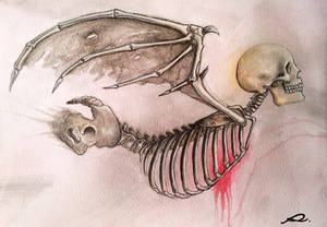
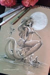
Here are couple of examples from various artists using cool perspectives and angles when presenting artworks:
Here are couple of examples from various artists using cool perspectives and angles when presenting artworks:


Light. It would be best if you could shoot your artworks in a daylight: it gives natural look and colors instead of musty yellow tones (or other weird colors) often created by artificial light. Unfortunately it is not often possible to go and shoot outside so inspect your house to find the place with most natural light. If you need to use artificial light, be careful with direct lights or flashlight because they might leave unwanted bright spots and glare or create too much contrast or shadows on your picture, making it difficult to see the finest details.
Example of my old artwork shooted in daylight and artificial light and as a scanned version.
All the images are otherwise untouched except the photos have been cropped.


The colors vary a lot! The truth is somewhere inbetween the photo taken in daylight and the scanned vesion.
The middle one, shooted in artificial light, is way too red compared to the original drawing.
All the images are otherwise untouched except the photos have been cropped.
The colors vary a lot! The truth is somewhere inbetween the photo taken in daylight and the scanned vesion.
The middle one, shooted in artificial light, is way too red compared to the original drawing.
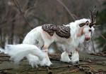
Notice what is on the background. Extra background is usually cropped away especially from drawings and paintings, but if you’re shooting sculptures it is a must to think what other stuff from your room will be captured in addition of the artwork itself.
Using neutral fabrics or fabrics which colors and patterns that are complimenting your artwork is an easy way to create nice backgrounds. Or maybe find an interesting place at your house or garden where to shoot your sculpture and make the background part of your artwork! However, don't go too wild and remember to keep your artwork in the focus instead of props stealing the show.
Examples from fellow deviants of creative use of backgrounds:
 <da:thumb id="488017949"/>


<da:thumb id="502229339"/>
<da:thumb id="488017949"/>
<da:thumb id="502229339"/>
That's all for now, stay tuned for the part 2! Meanwhile, take a look at these tutorials to find out more advanced tips about taking the best possible photos of your artworks:


Discuss:
- Do you rather scan or photograph your artworks?
- Have you faced any difficulties scanning/photographing your artworks? How have you solved those?
- Share your best scanning or photographing tips in the comments!